|
|
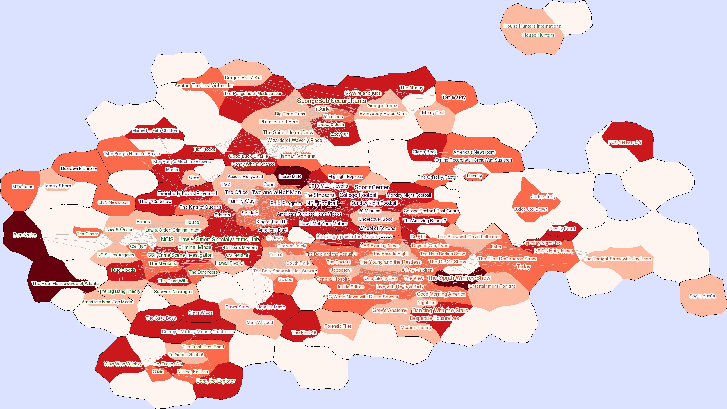
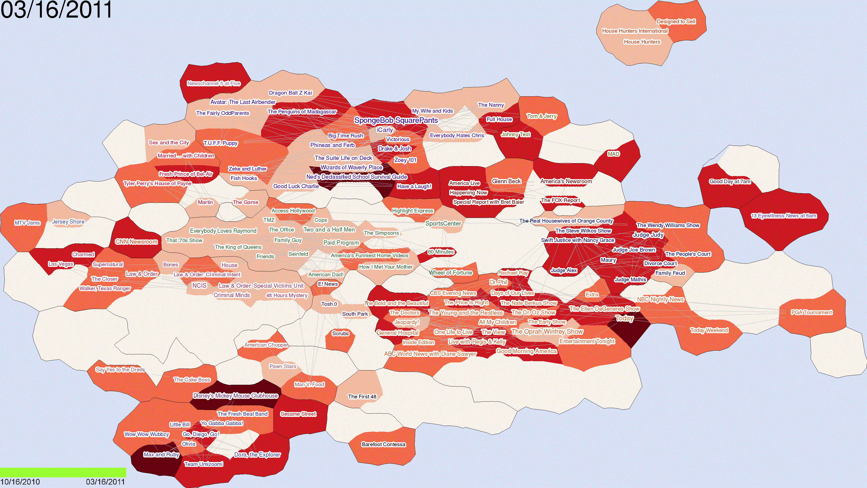
| A heat-map visualization of the IPTV dataset. The label font sizes represent popularity for each 1-month time period, whereas darkness of heat-map colors corresponds to the magnitude of difference in popularity from the previous snapshot. For instance, "Inside MLB," which is shown with relatively small label but with the darkest heat-map color, can be considered as a program that gained popularity in a short period, while "NFL Football" is a program with constantly high popularity. |
|

|
|

|
|
|
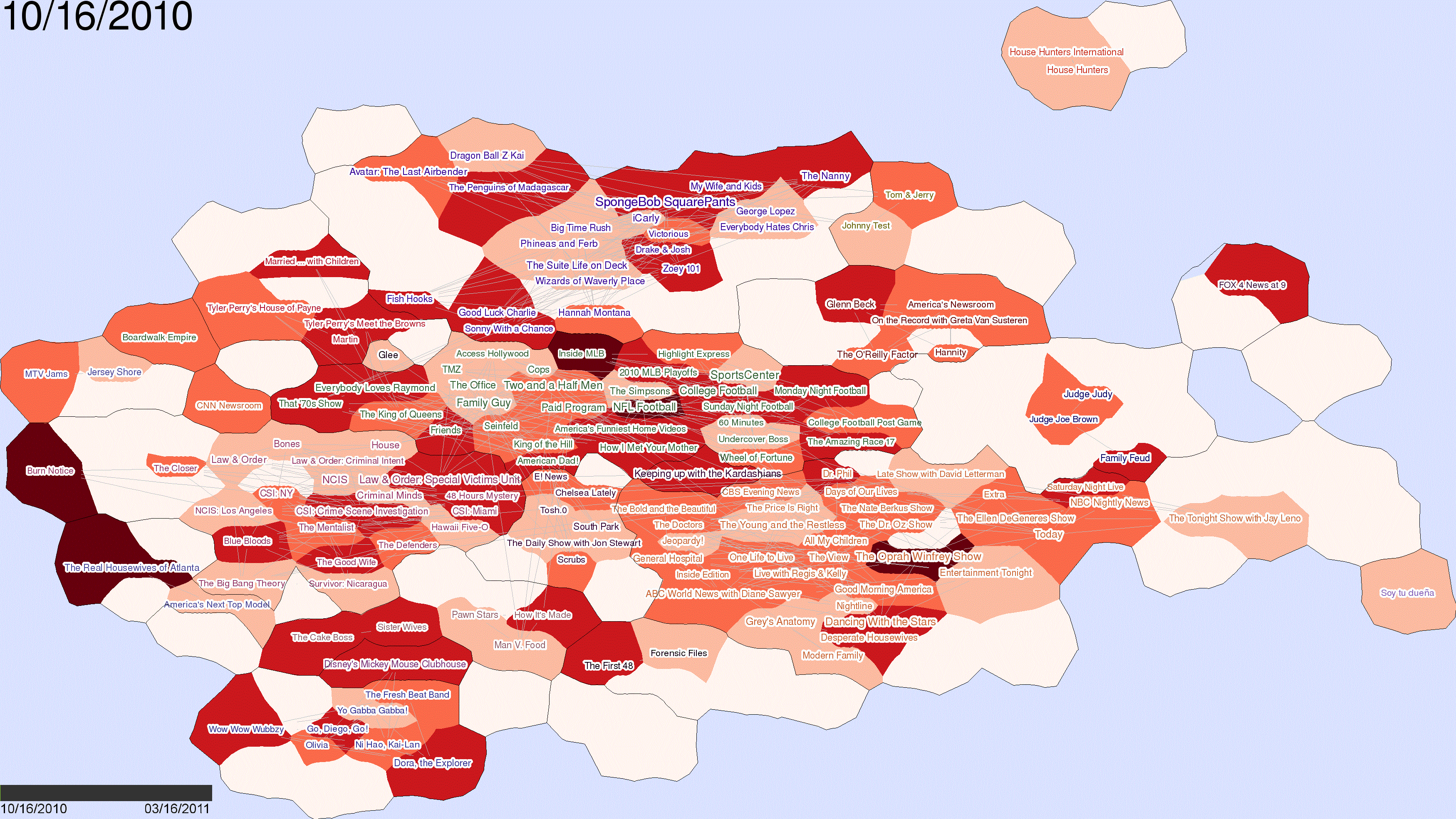
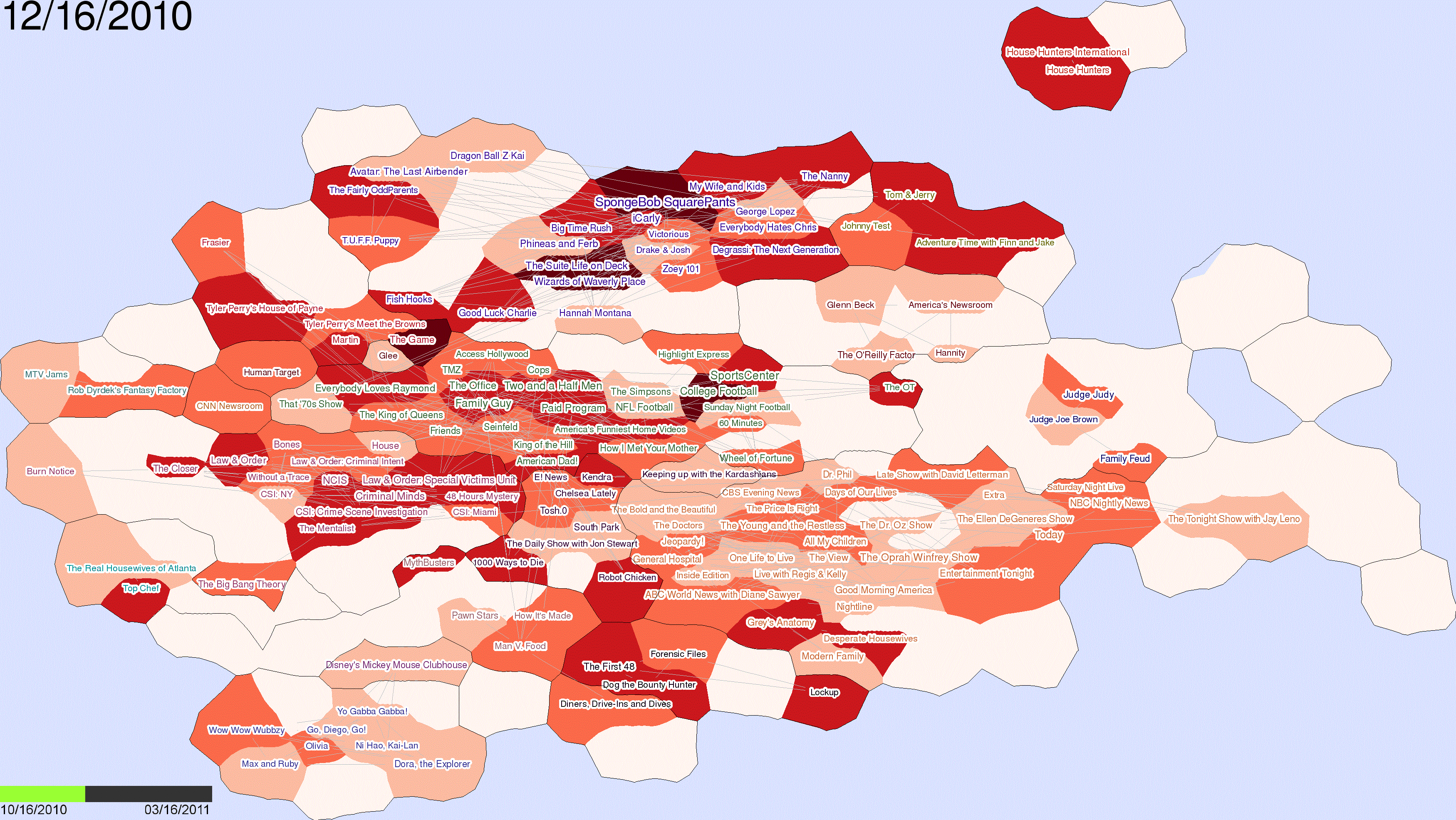
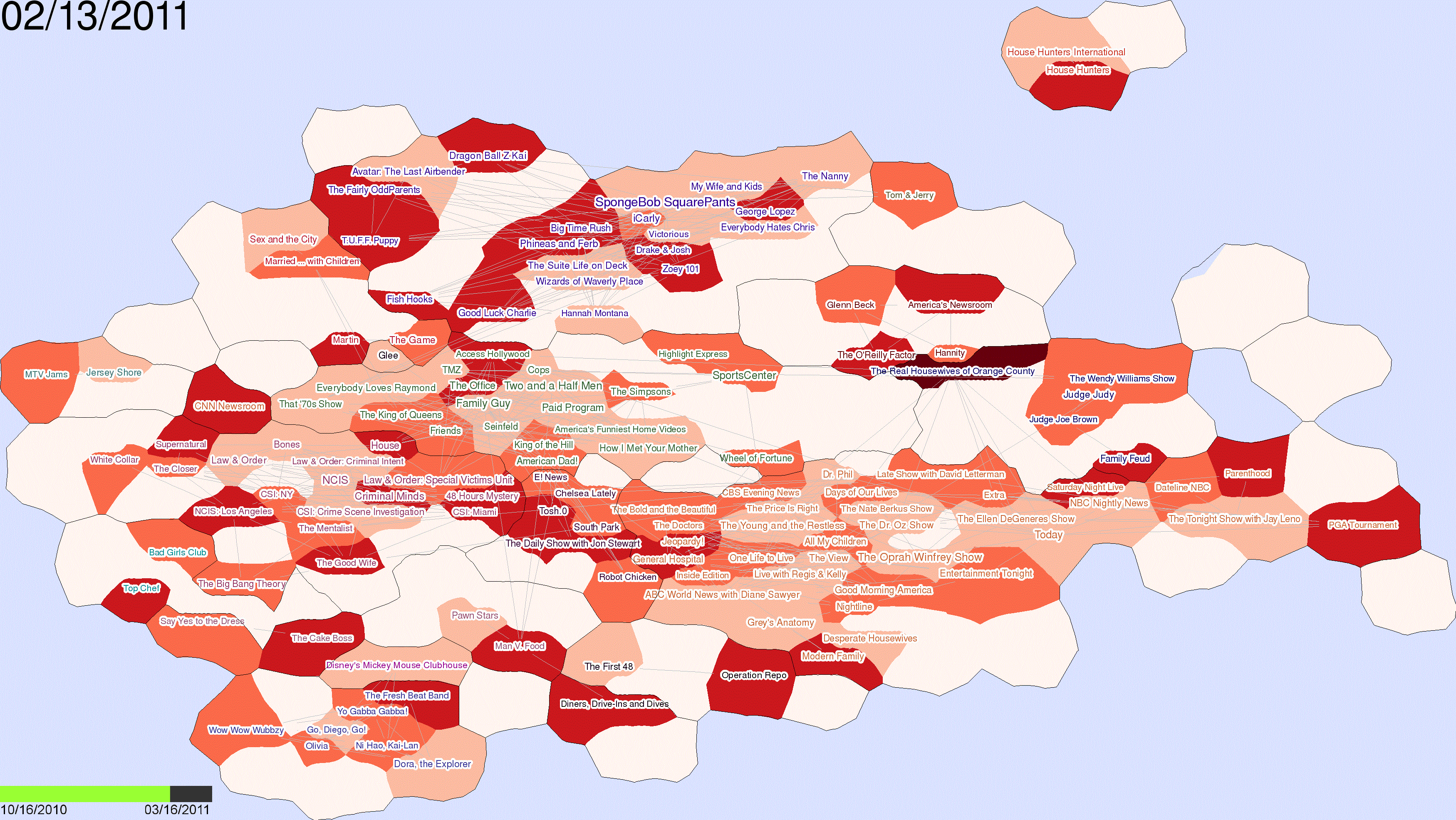
| Frames from the animated heat-map visualization of trends in IPTV. A number of observations can be made. For example, "Burn Notice," which is located in left of the map, initially shown with the darkest color, gradually lost popularity and eventually disappeared from the map. This corresponds to the fact that the show, at its third season, started in June, 2010, and ended in mid-December that year. |