

|
|
|
| (a) A map of 18,000 artists created with no modification, which suffers from significant fragmentation | (b) A map of 18,000 artists created with modified edge weights |
|
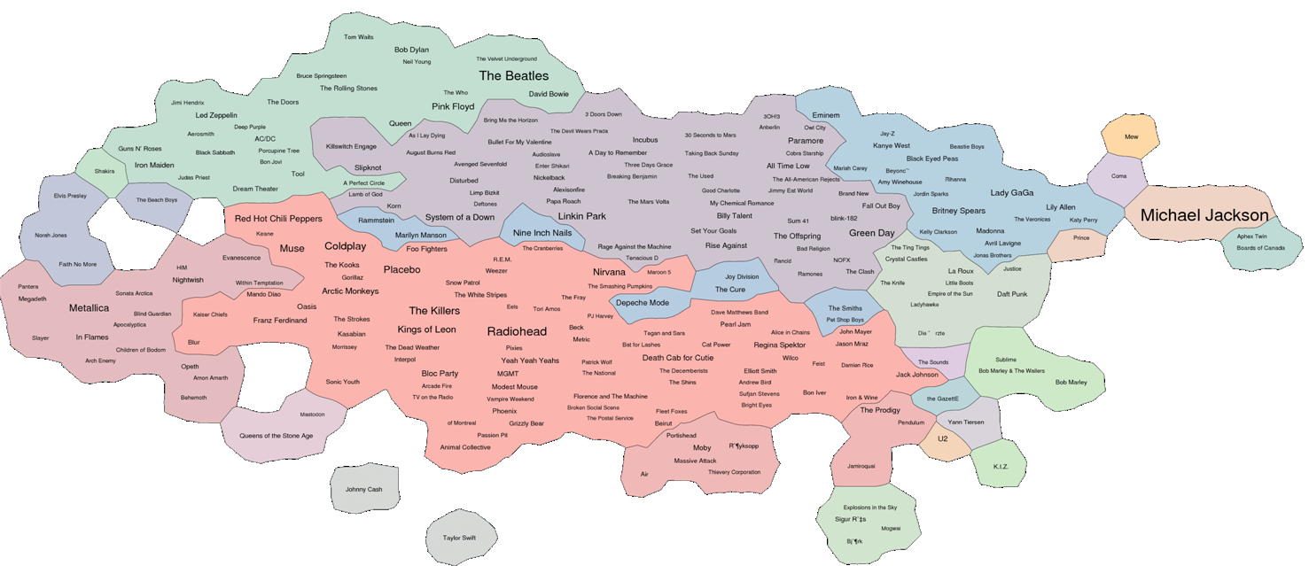
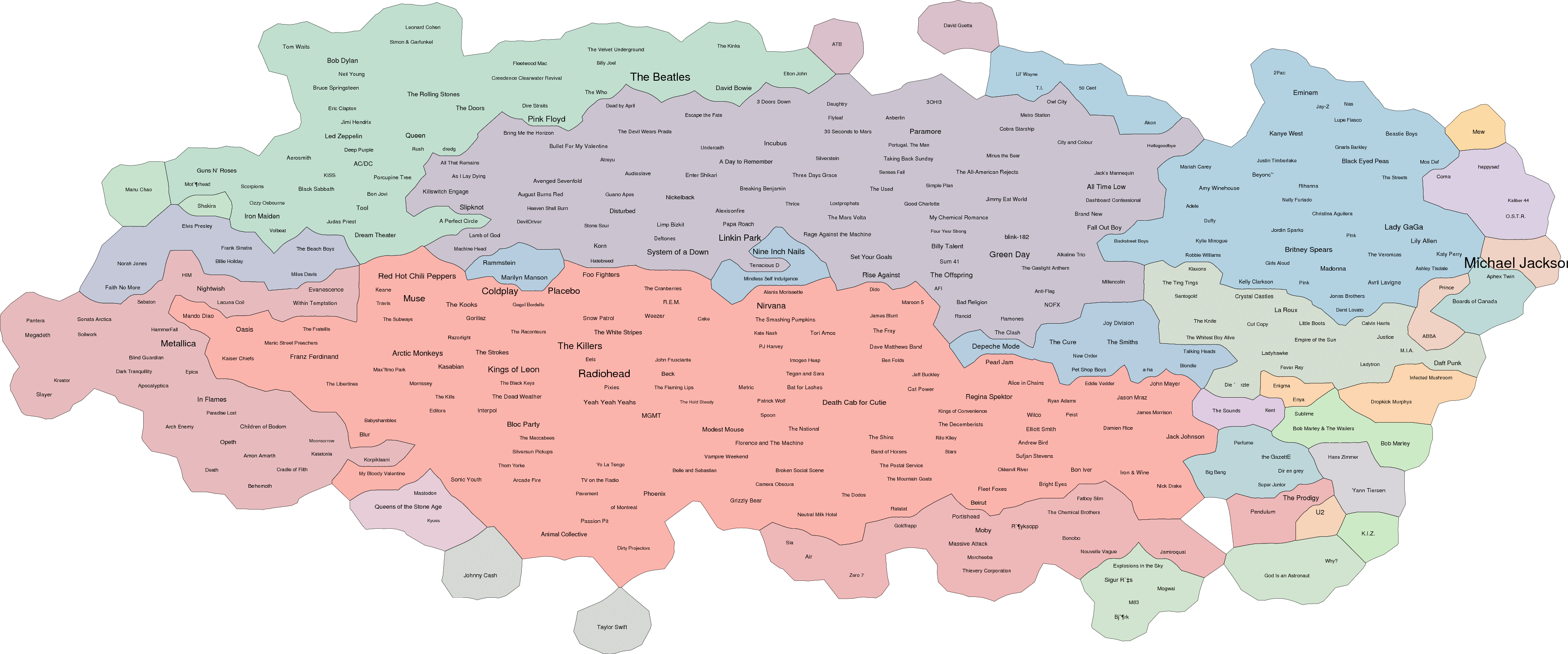
| The top 250 artists: showing artist popularity through font sizes, while also displaying similarity using the geographic map metaphor. |

|

|
| Two consecutive heatmaps, one month apart in the fall of 2009, showing increased interest in Lady Gaga at the expense of nearby Britney Spears. The data comes from the Internet radio station last.fm, which tracks millions of listeners. | |
|
|
|
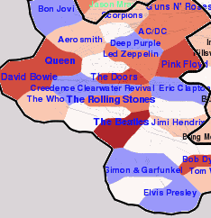
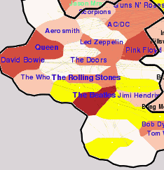
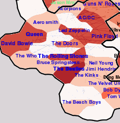
| (a) Highlighting areas where artists are about to disappear: Bon Jovi, Deep Purple, Elvis, Simon \& Garfunkel, CCR, and Eric Clapton. | (b) Highlighting the areas where new artists are about to appear: Bruce Springsteen, Neil Young, The Kinks, and The Beach Boys. | (c) An image after the appearing/increasing phase. |
|
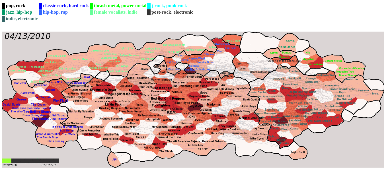
| A snapshot of trend visualization of last.fm. On the heat-map, darkness of the color indicates the degree of increse in short-term popularity while font sizes of artists correspond to long-term popularity. Labels of artists who are out of the top 250 are hidden and colored white. Clusters based on similarity are represented with black boundary lines as well as label colors, which are mapped with country names shown on the top of the map. Date label located on the top-left corner indicates the timestamp of the map, and the progress bar on the bottom-left shows the position of the map in the entire animation. |
| (1) | 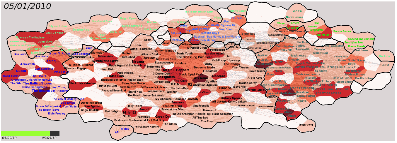 |
| (2) | 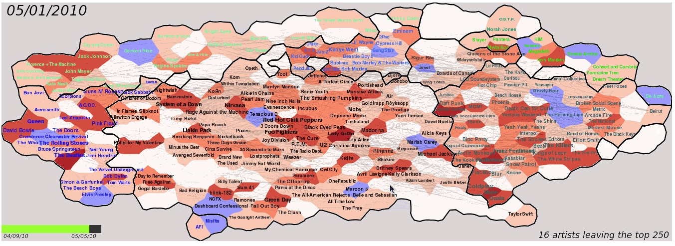 |
| (3) | 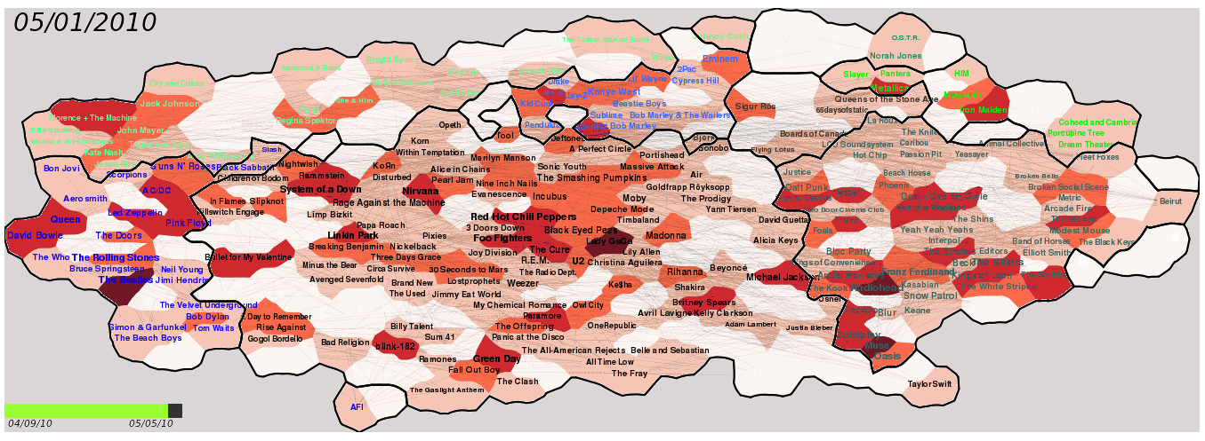 |
| (4) | 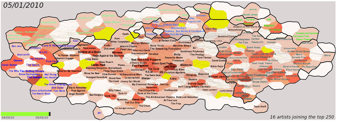 |
| (5) | 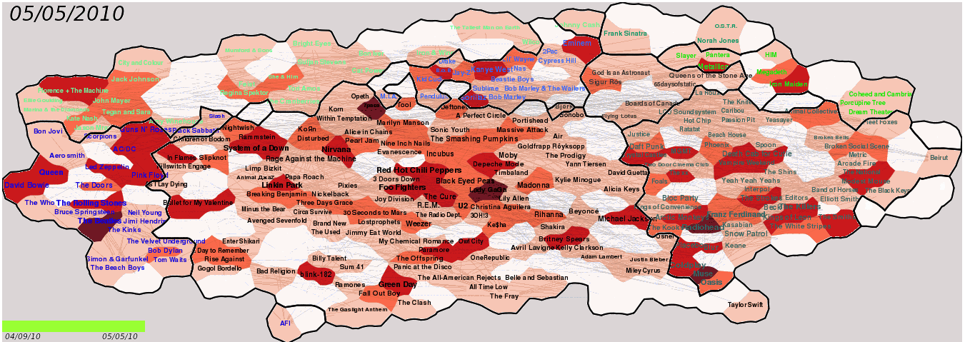 |
| A sequence of animation frames. (1)Base map of 05/01/2010. (2)Disappearing artists are highlighed with blue. (3)A frame after disappearing/decreasing phase. (4)Appearing artists are highlighed with yellow. (5)Base map of 05/05/2010. | |
|
| An animated map that shows popularity changes only by means of font sizes. It is not easy to identify what changes are happening on the map even though it well follows geographic map metaphor. |